HFire IcontSpots.ai

Mapping heat, growing green.

Explore urban heat vulnerability and tree planting priorities in Toronto for sustainable development.

It'sIt'sSUPERSUPERhothotoutside.outside.WeWeknow.know.ButButconsiderconsiderthosethosewhowhoareareespeciallyespeciallyvulnerable.vulnerable.

489,000 heat-related deaths occur annually.

nothing's being done and that's increasing due to global warming.

Heat-related deaths by year
Rising global heat-related deaths, 2020–2024
Trending up to 489,000 by 2025
2020 - 2024

Heat-related deaths are rising each year due to climate change, urban heat islands, and vulnerable populations lacking access to cooling or green space. Addressing these issues is critical for public health and urban resilience.

So what did we do about it?

We put on our thinking caps and built a machine learning model that accurately showcases "HotSpots" in Toronto based on vegetation and urban island heat influencing factors.

TLDR; Check for trees and building density around a specific location. Mix it in with temperatures and some special ML magic and you get a heat vulnerability score.

Normalized Difference Vegetation Index (NDVI)
Land Surface Temperature (LST)
Building Footprint Density
Google Earth Engine
Vulnerability ML-Model
Gemini-2.5-Flash Tuner
Tuned Weights
{
  w1: 0.6,  // temperature
  w2: 0.2,  // vegetation
  w3: 0.2   // buildings
}
NDVI raster gif
Google Earth Rasterization of NDVI
NDVI raster shows vegetation health and density across Toronto, with brighter areas indicating more vegetation.
LST raster gif
Google Earth Rasterization of LST
LST raster shows land surface temperature across Toronto, with brighter areas indicating higher temperatures (hotter urban heat islands)

*Notice how areas near the waterbody are darker which corresponds to cooler temperatures.
Machine Learning Model Dataframes

Data Classifications for ML Model

As part of feature extraction, we rasterized both building density and tree density into uniform 100 m grid cells across Toronto.

These become two of the three columns in our feature matrix X (the third being normalized temperature). We then fed X into our Random Forest, which learned how those spatial patterns combine to predict heat‐vulnerability scores.
Tree Density raster
Tree Density Raster
Tree density raster shows the distribution of tree cover across Toronto. Each pixel in the grid represents the density of trees in that area—brighter areas indicate higher tree density, while darker areas indicate fewer trees.

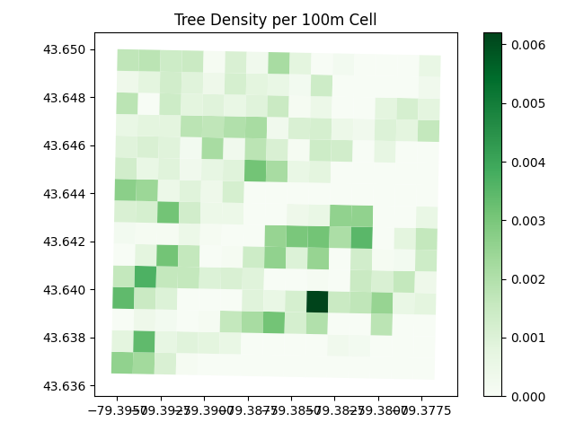
In ML terms: Vegetation input (proxy for NDVI), representing normalized tree/vegetation cover for each 100 m cell.
Building Density raster
Building Density Raster
Building density raster shows the concentration of buildings across Toronto. Each pixel in the grid represents the density of buildings in that area—brighter areas indicate more buildings, while darker areas indicate fewer buildings.

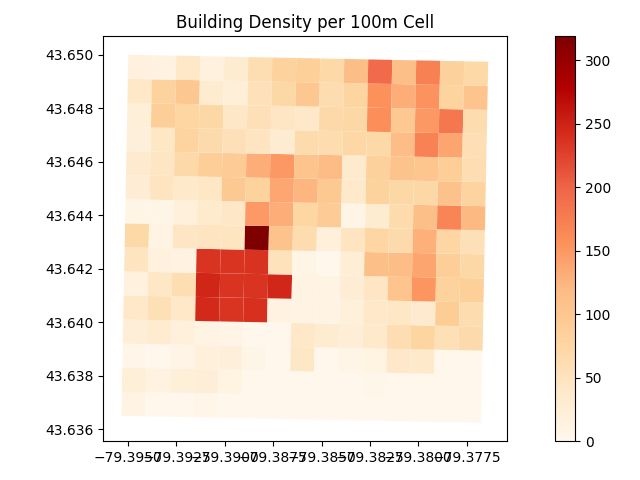
In ML terms: Urbanization input, showing how built-up each grid cell is (m² of roof per 10,000 m²).

Enough Technical Talk. Check out the 3D City Visualization